Mundial Magazine has come a long way in a short time. Having only recently published their first issue (Well, their second but we won’t get into that) they’ve really made their mark. It’s really easy to be cynical about football these days, but a football magazine that concentrates on stuff it’s impossible to moan about is ok by me.
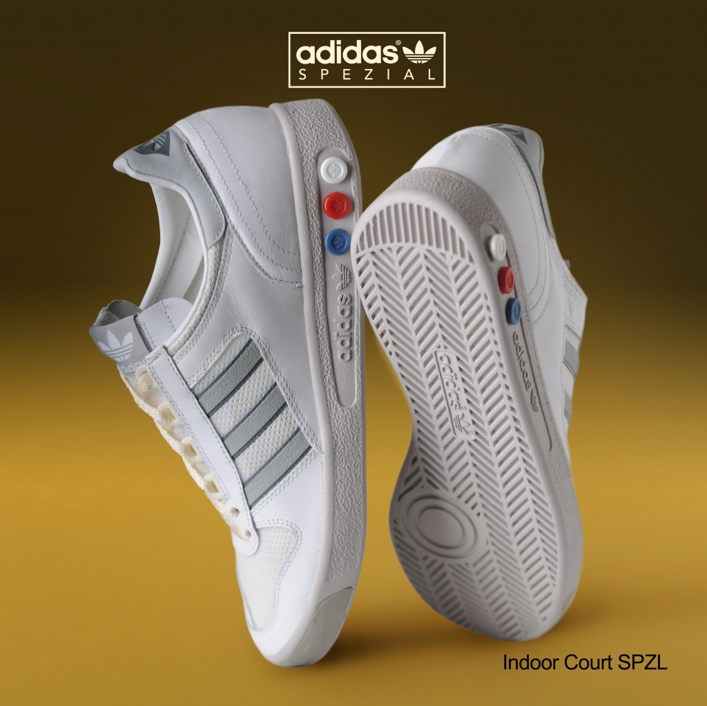
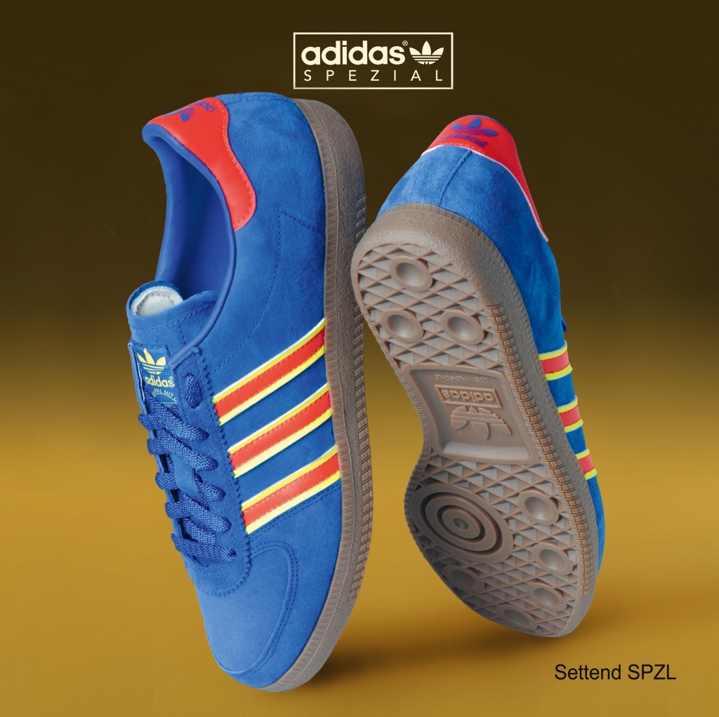
Mundial isn’t afraid to stray a short hop away from the confines of the football ground though. This issue explores the various subcultures that exist amongst the supporters of the game, crucially without sounding like boring old Daduals. The bobble hat revolution in which our mates at casualco have played a central role is covered, as is the recent SPEZIAL range, something adidas have aimed fairly and squarely at lads like us. Here’s a little taste of what you could expect if you took the plunge and bought an actual, real copy of Mundial.
Nice one to Daniel off the Internet for giving us the scoop on this excerpt of their interview with Gary Watson, the graphic designer who helped Gary Aspden and Mike Chetcuti make a dream a reality.
To read the full thing, get a hold of a copy here.
Can you tell us a little bit about the inspiration behind the work that you’ve done to promote SPEZIAL SS15?
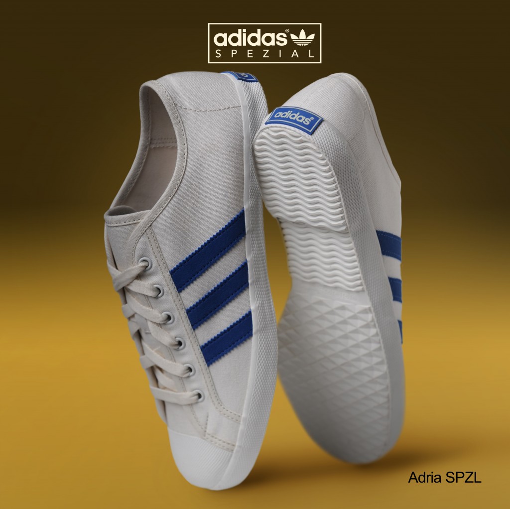
The inspiration for artwork for adidas Originals x SPEZIAL SS15 comes from a variety of sources from both adidas’s & my own archive, The mirror shot of the Adria SPZL is based on an early advert on my office wall (which came from a US mag) that I’d been itching to re-create for a while. For me it’s the perfect way to display a shoe, absolute genius, one shoe shown from every angle. Top, bottom, sides, back – all bases covered in one shot.
The mock catalogue pages are again a direct reference to a German catalogue of 1979, which had beautifully shot shoes on bright backgrounds with the sole units fading into the background, we felt this style sits well within the latest adidas Originals x SPEZIAL SS15 footwear collection as they both subtly nod to that period of time.
There are iconic design tropes throughout the history of adidas, some more famous than others, what stands out most for you?
There is a great catalogue from 1976, the one with the shoes placed on newspapers and magazines at various angles and directions. It is also the one that I’ve referenced within the first two SPEZIAL footwear collection group shots. They are just flawless and breath-taking in execution, they have made it look so easy with these shots – try re-creating them!! For me they remind me in modern day terms of Tracey Emin’s ‘my bed (room)’ in they look like what any young lads bedroom floor of the 1980s and 1990’s would want to aspire to, so I also suppose what I’m trying to say is “these would look bloody good on your bedroom floor as well as your feet!
Through SPEZIAL we’ve seen a return by adi to a more traditional, European style: Was this an important element to thread through your work?
There’s lots of nods and hat tipping within the adidas Originals x SPEZIAL range to the well designed garments, fabrics and footwear from the archive. For me the artwork had to reflect the range in the same way, borrowing from tradition and adding a more contemporary twist is the SPEZIAL style. For me the traditional “European style” is what SPEZIAL is and wants to be. Everything about that time and style (70s / 80s) said quality and craftsmanship. As a brand, the colours, the finish, fabrics & shapes were very refined and that is very much the vision for the SPEZIAL range.
What are your earliest memories of adi design?
The first time I really took notice of the design was on the French box of my first pair of adidas- ‘Jogger’ made in France in my early teens – it was the one with the stick men “sport for all’ style graphics all over the box – I spent hours trying to draw the stick men in their various positions, lifting weights, fencing, playing football, it must have left a lasting impression as I’m still doing it now!
Are there any other iconic brands that you think work in a similar way to adi?
Might be Because of my love of all things German but for me it would have to be Volkswagen, there’s lots of comparisons here, more iconic German branding, similar aged companies that developed over the same period of time to what they are today and both with a rich, well illustrated tradition of quality, innovation and craftsmanship.
The 1950s illustrations by Bernd Reuters for Volkswagen are some of the most visually stunning hand drawn images I’ve had the pleasure to see, wish he’d drawn adidas!